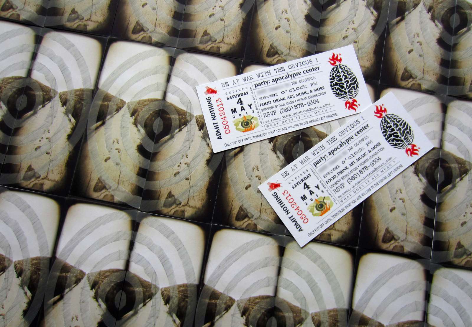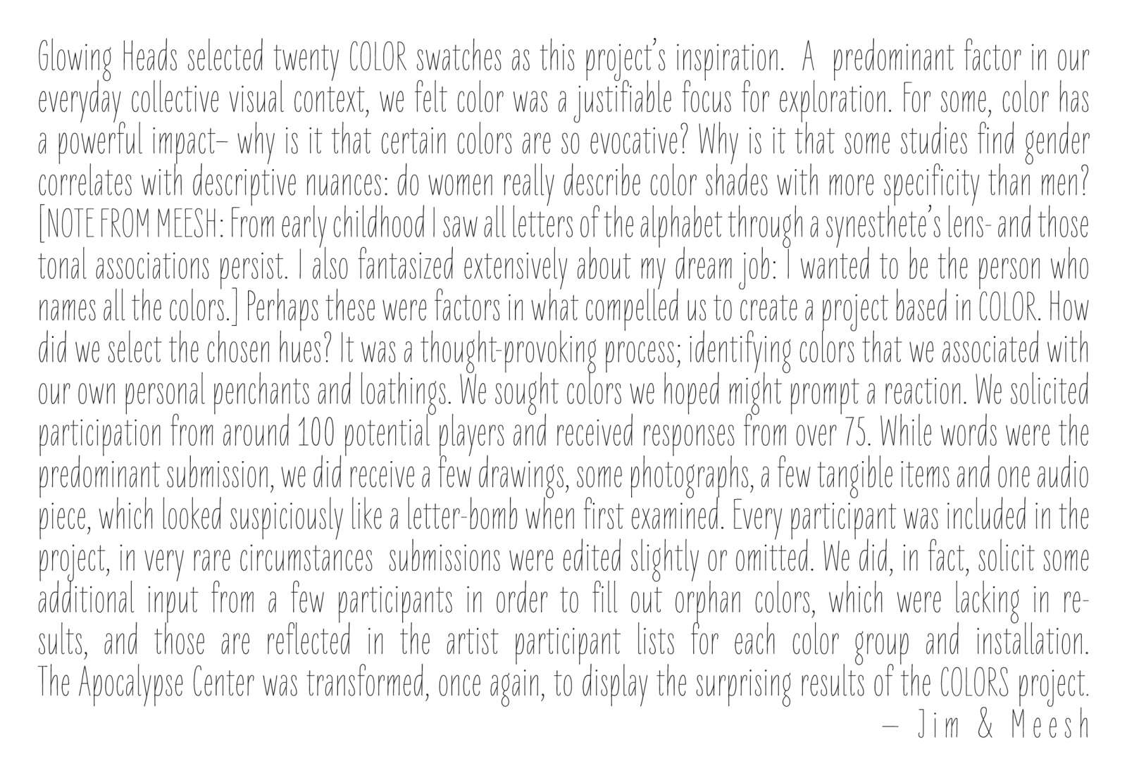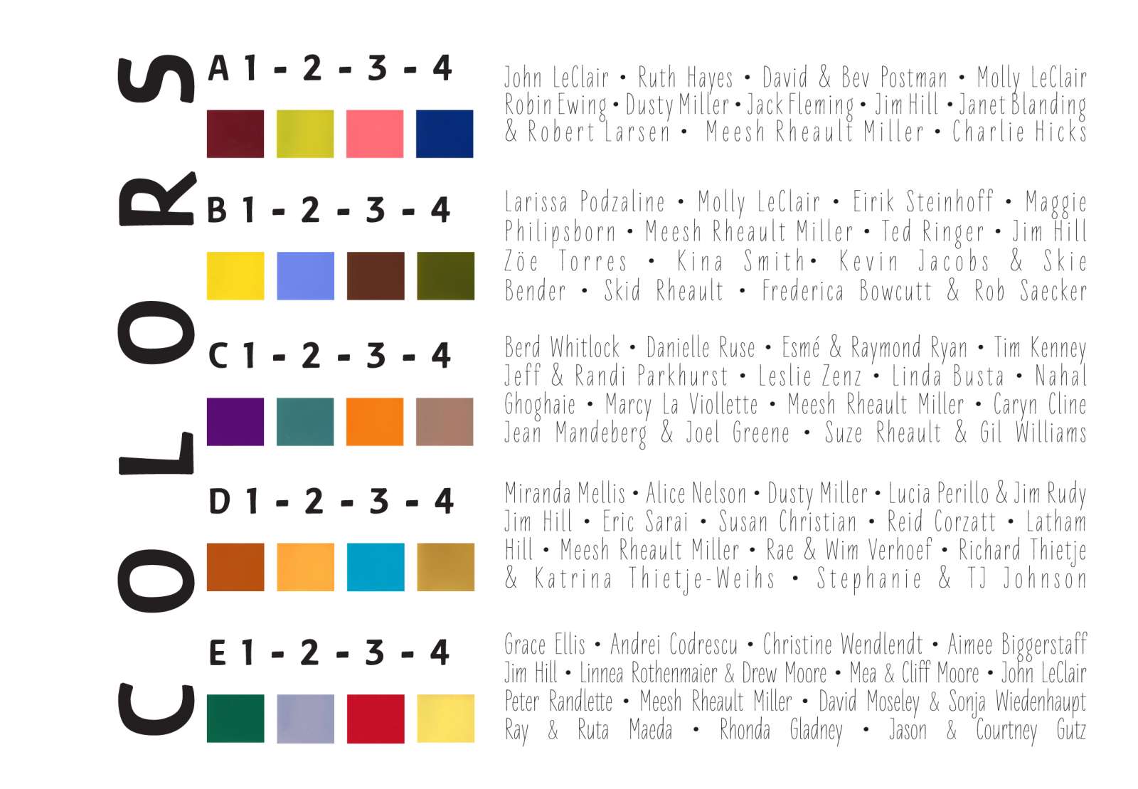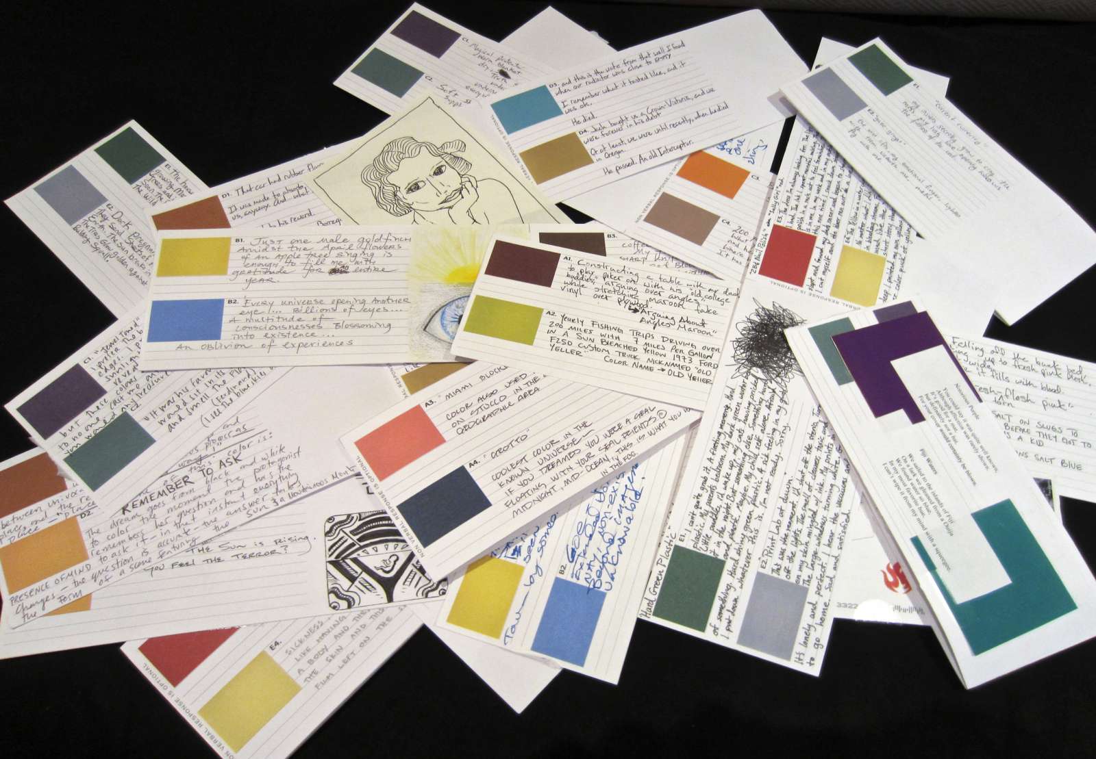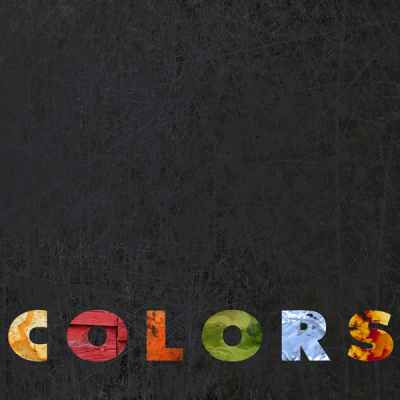

The Color Project
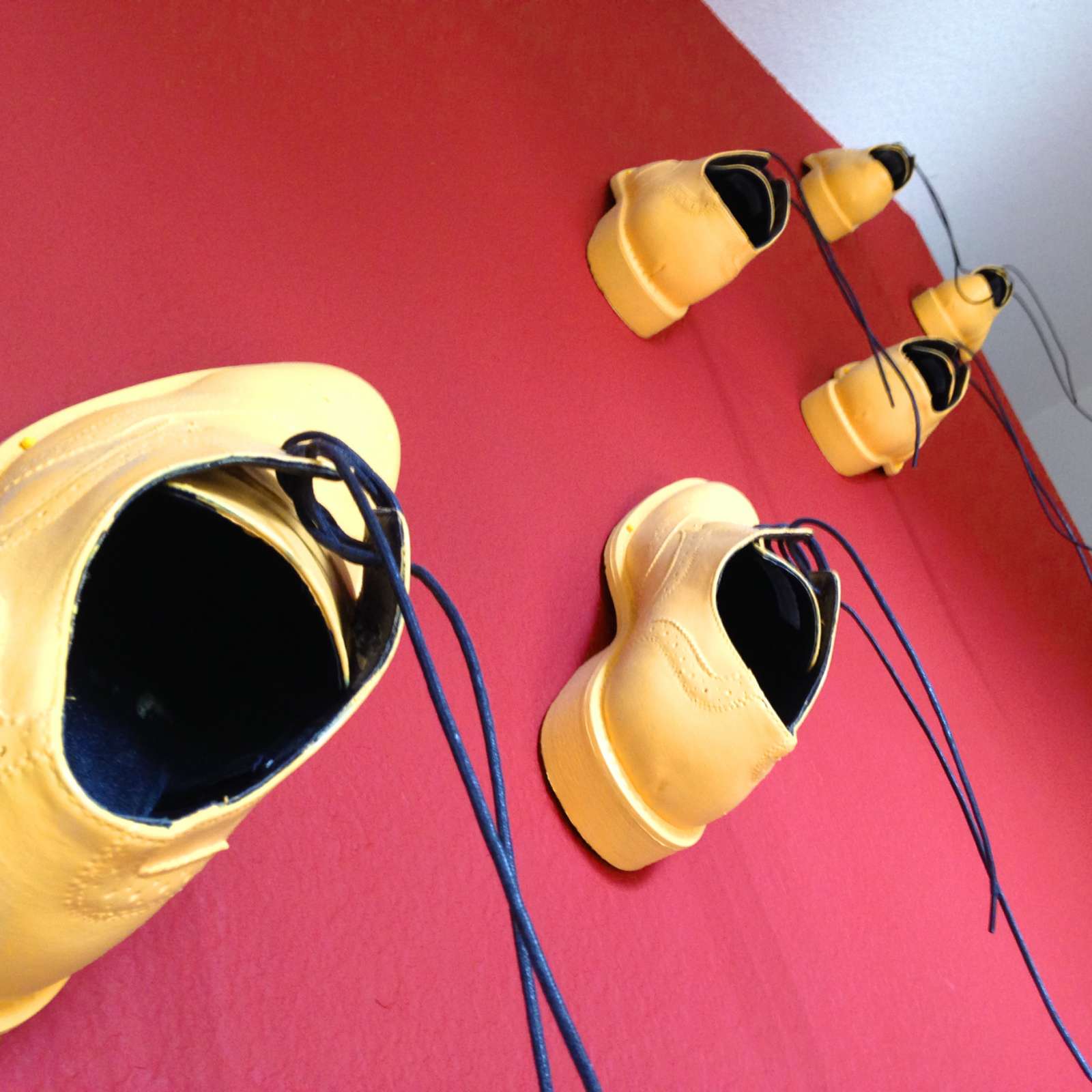
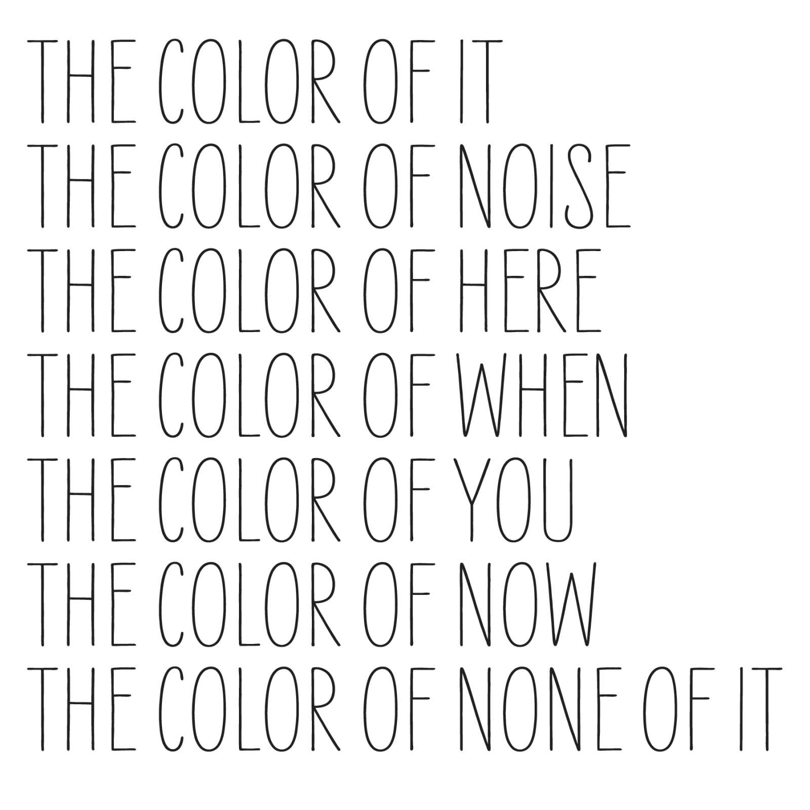
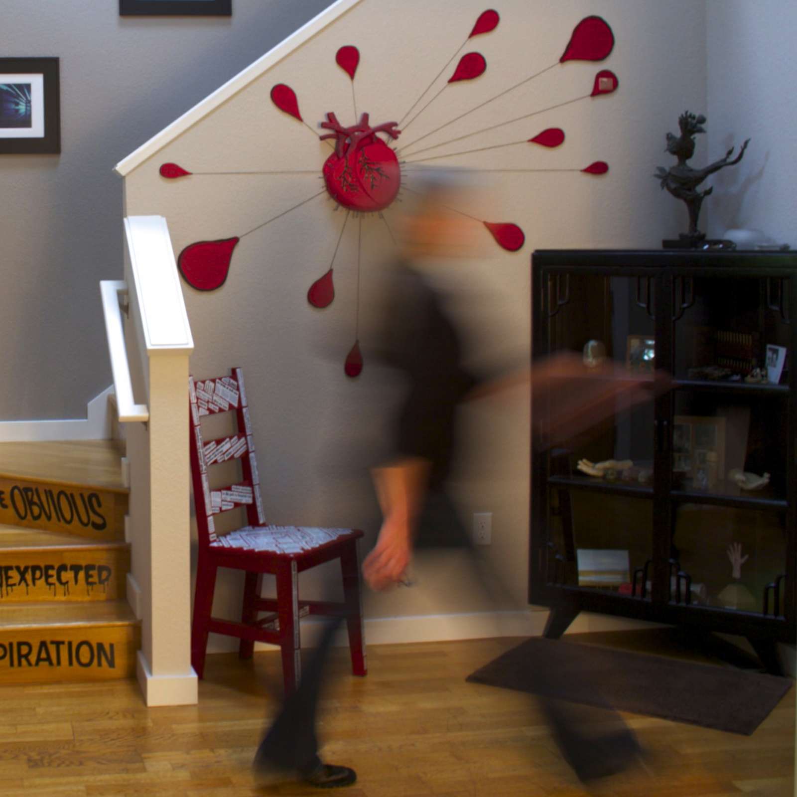
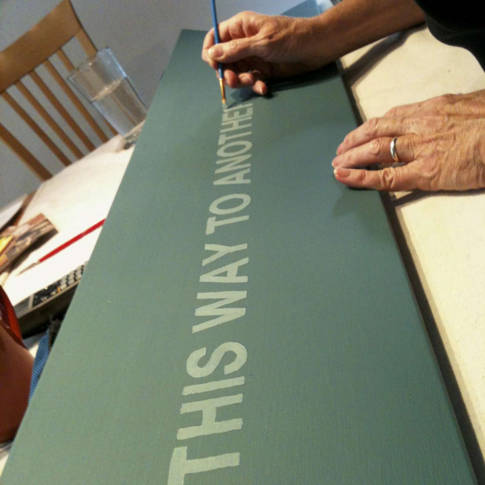
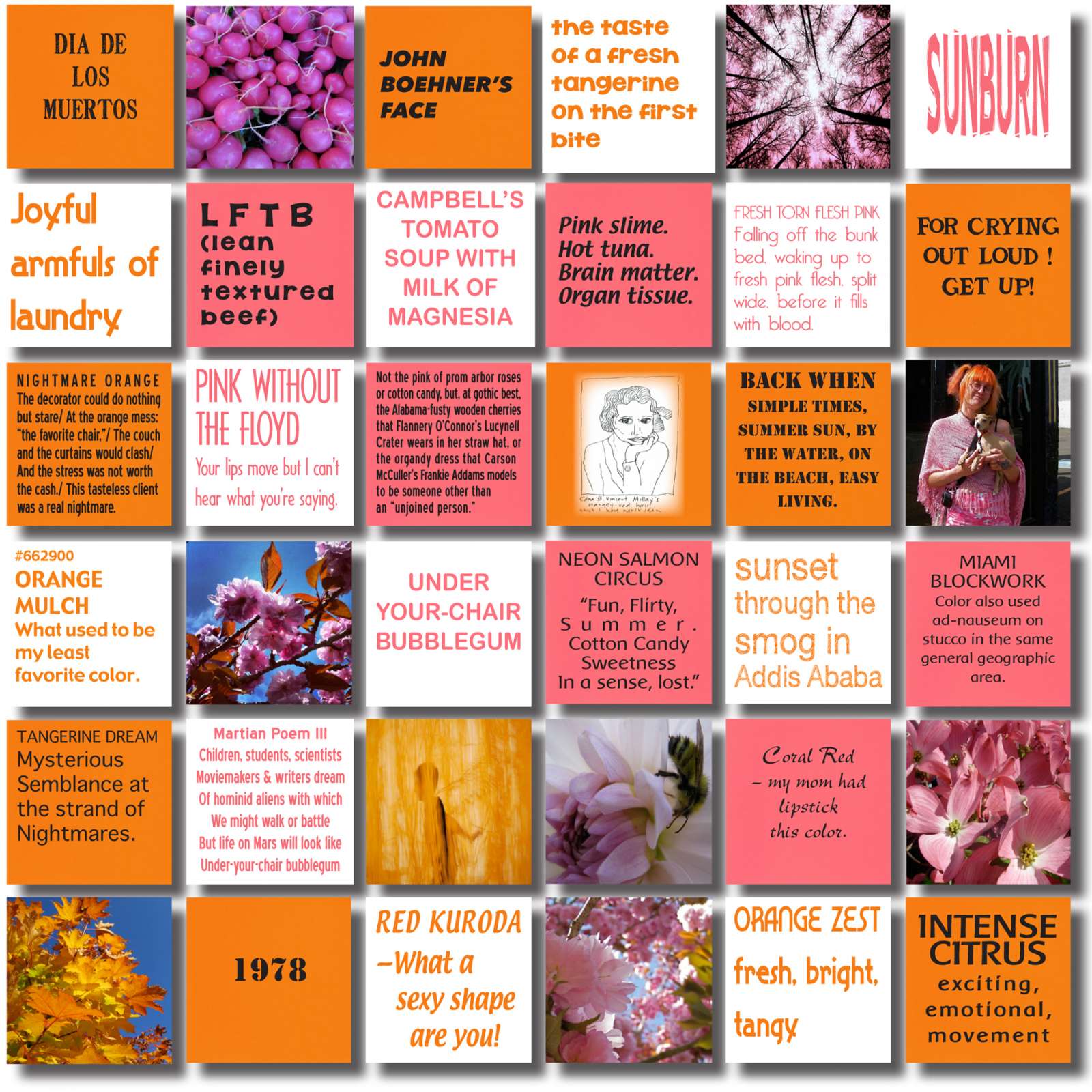
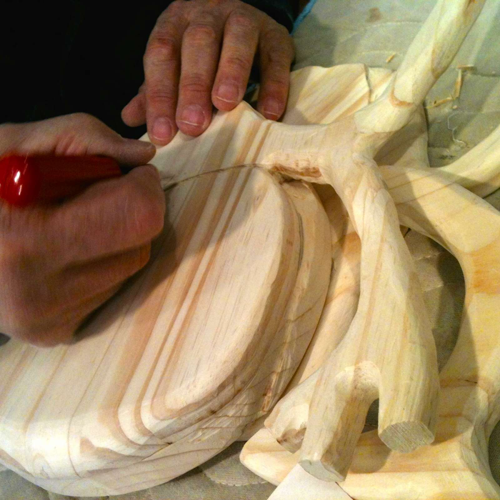
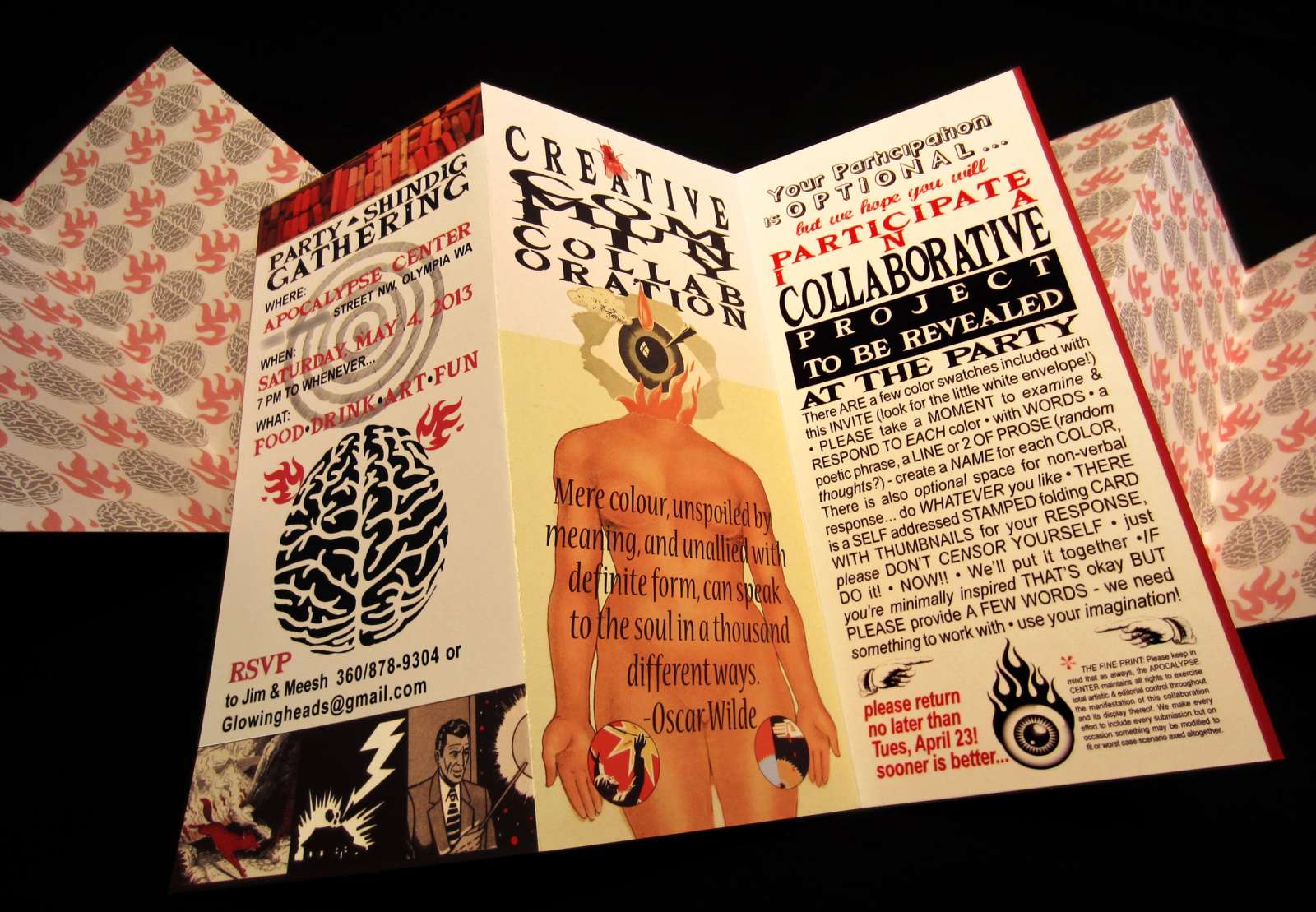
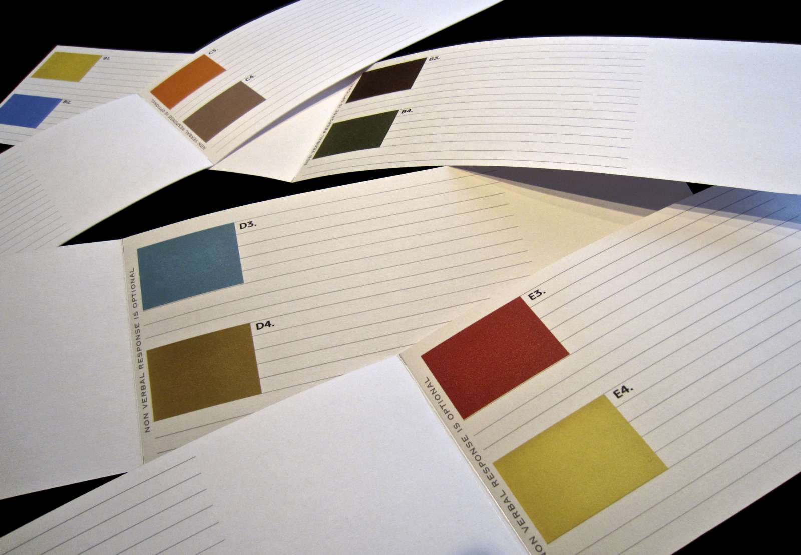
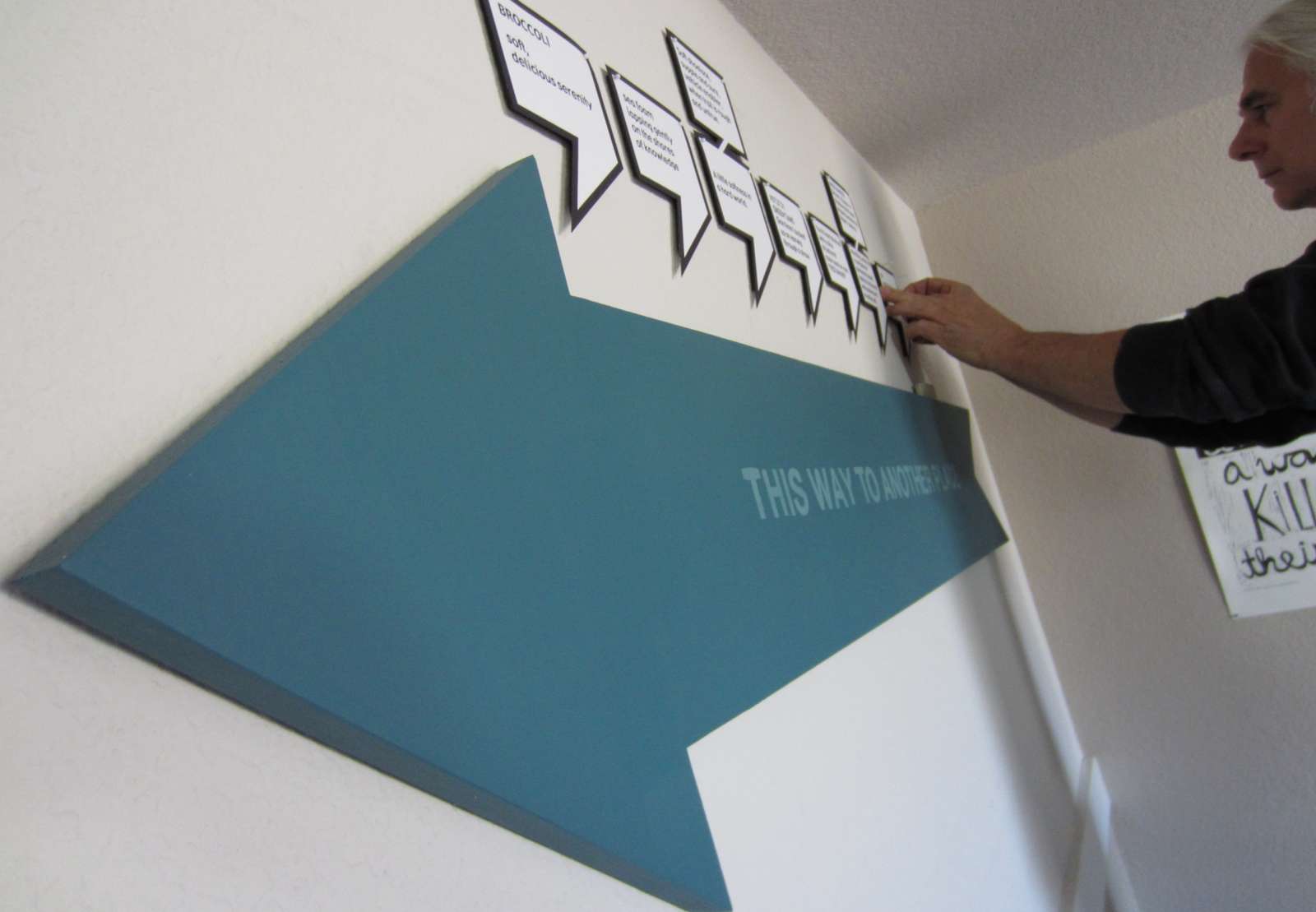
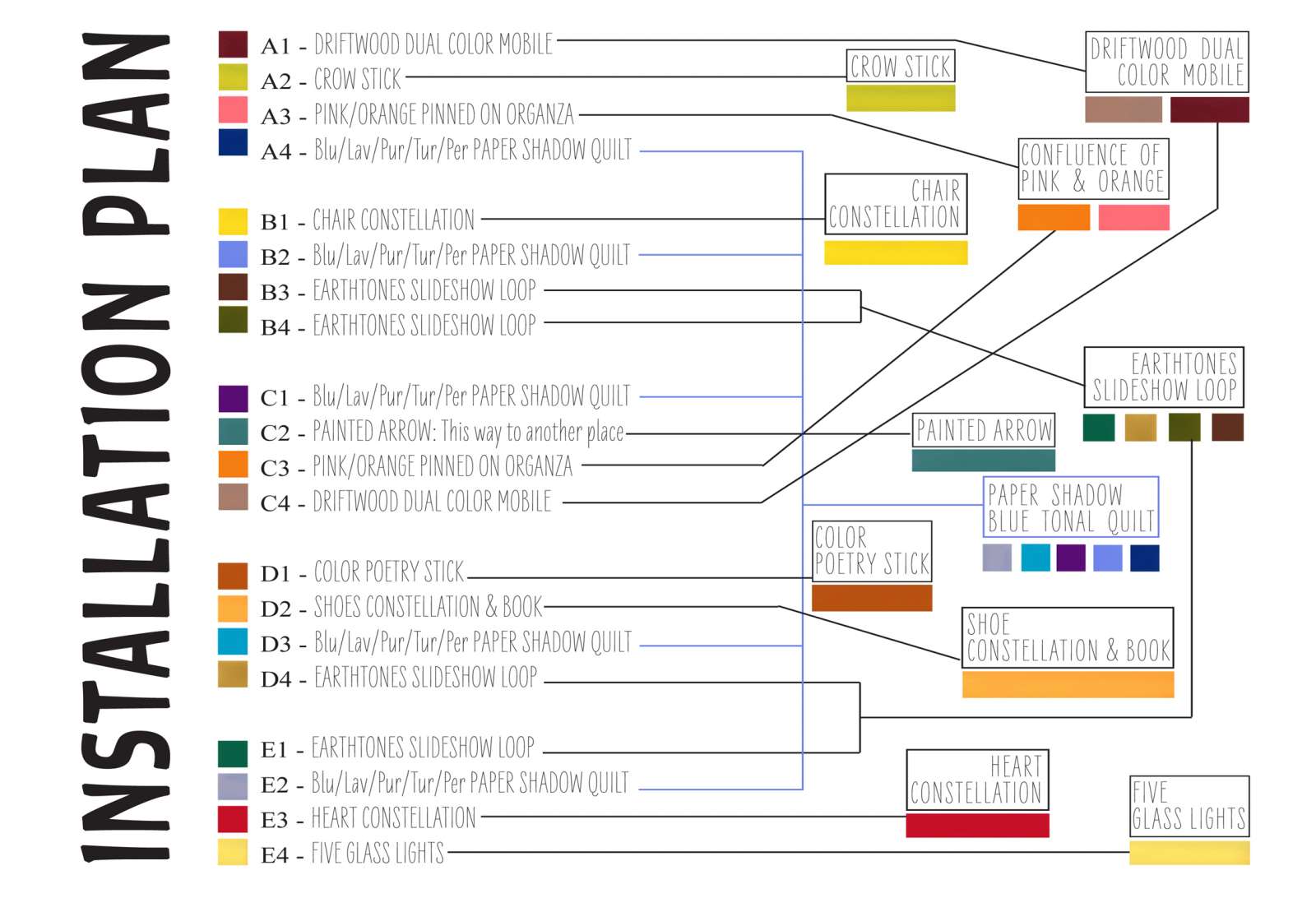
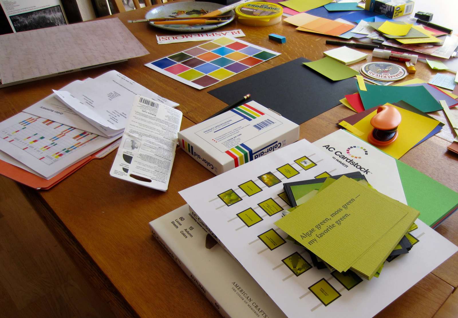
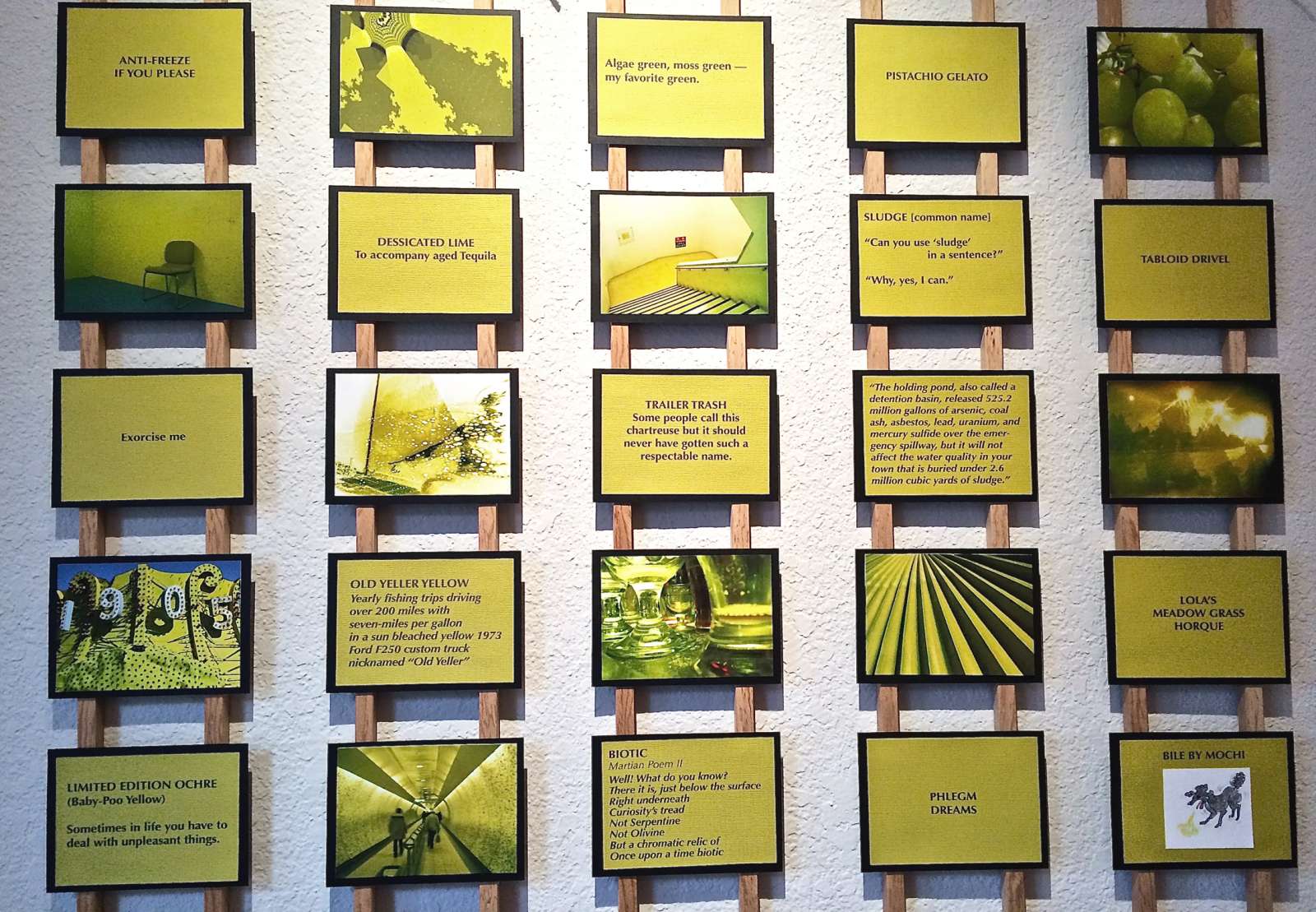
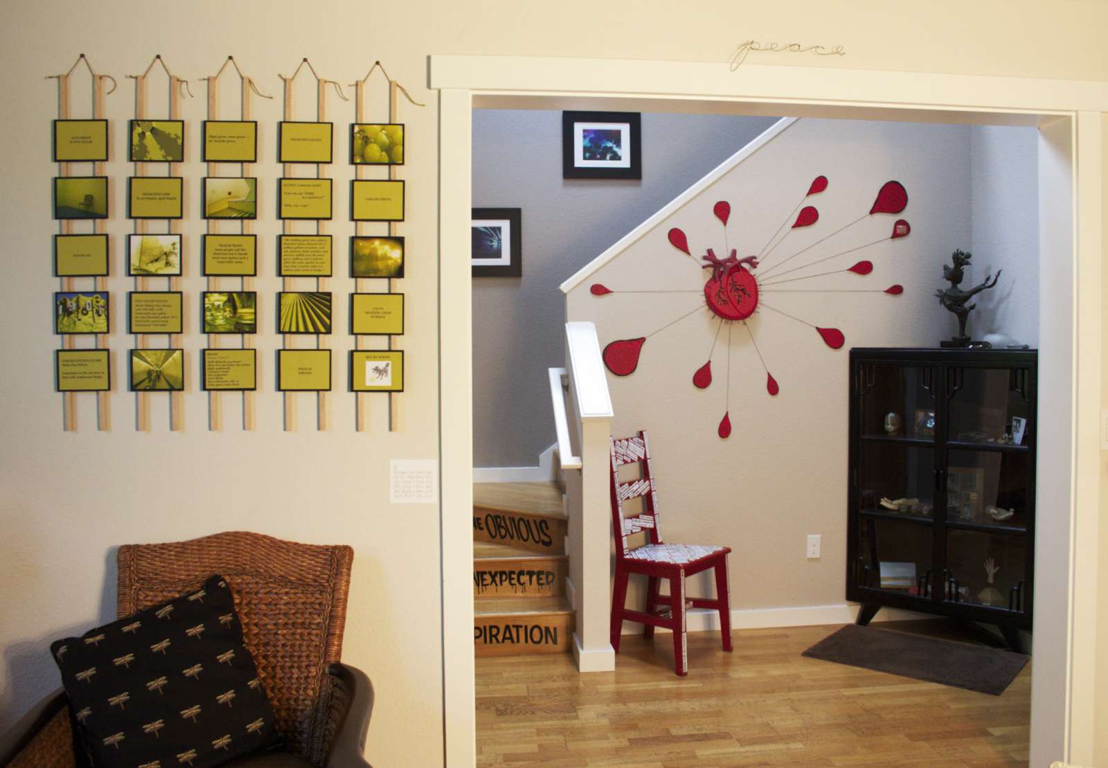
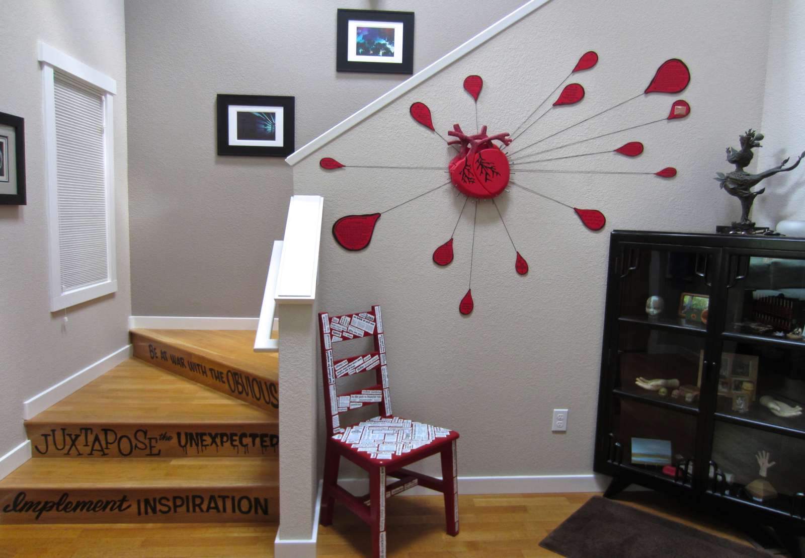
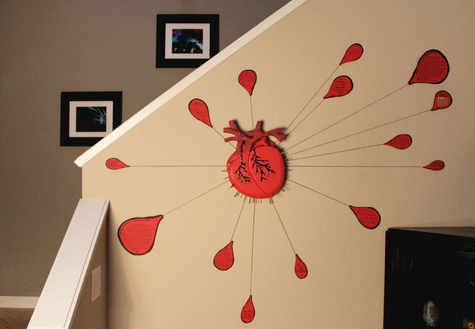
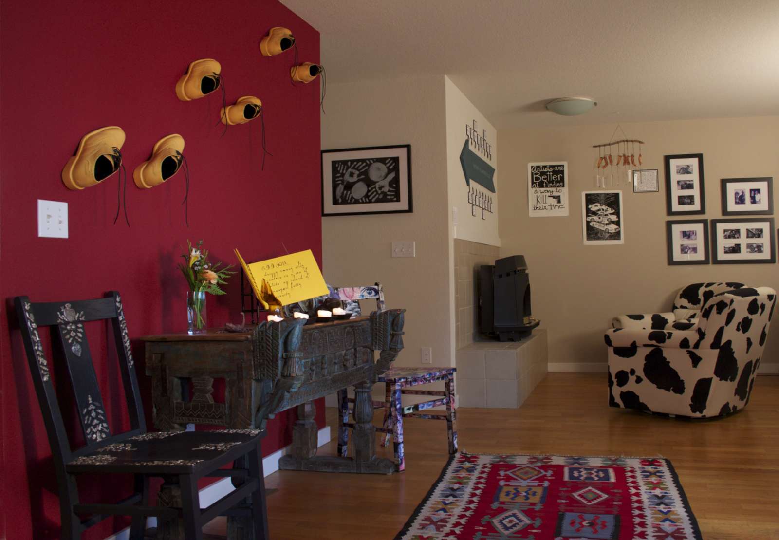
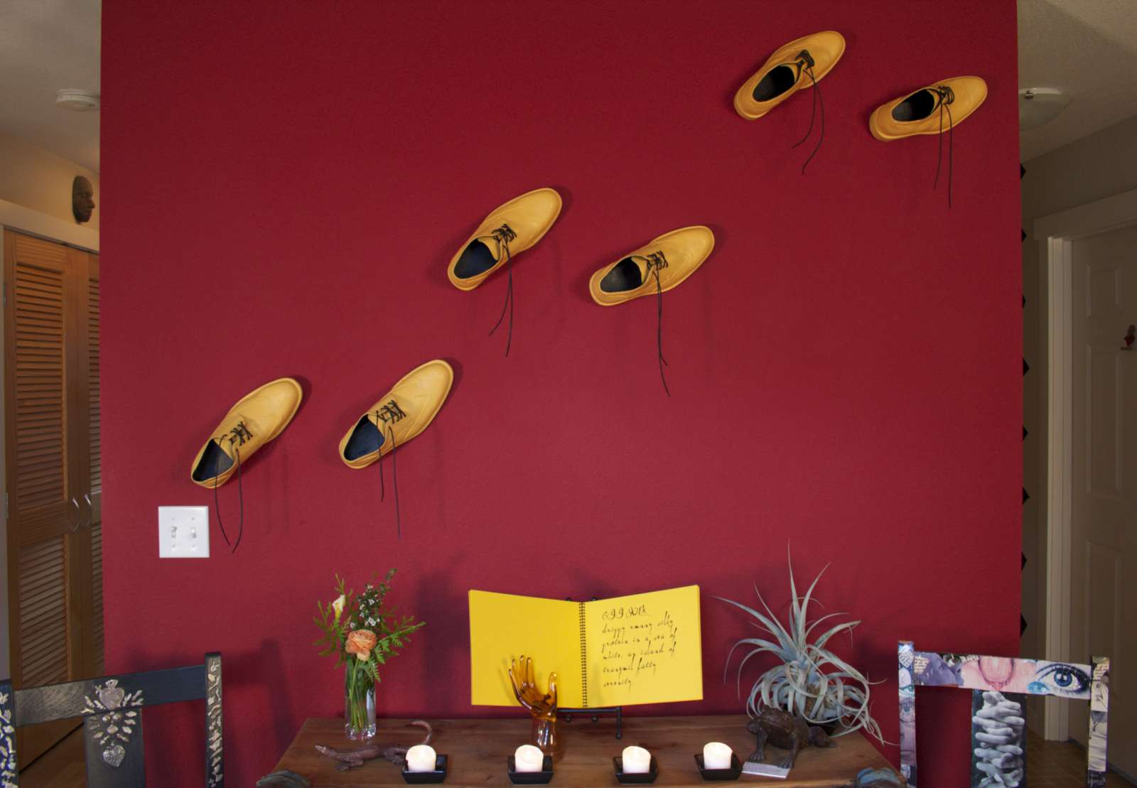
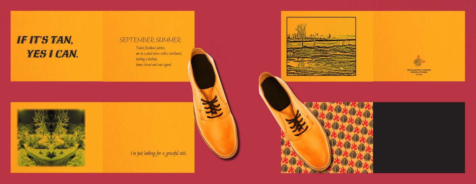
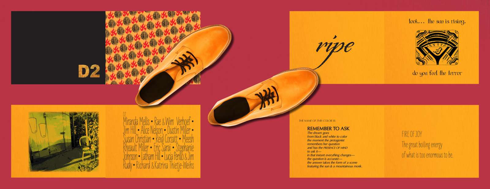
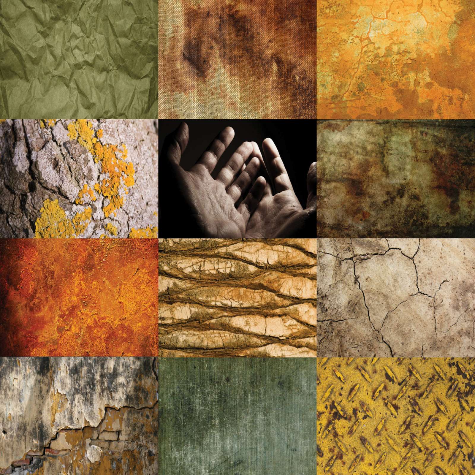
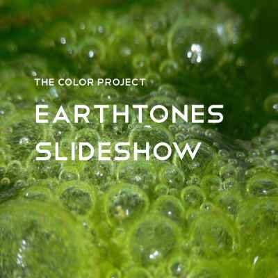
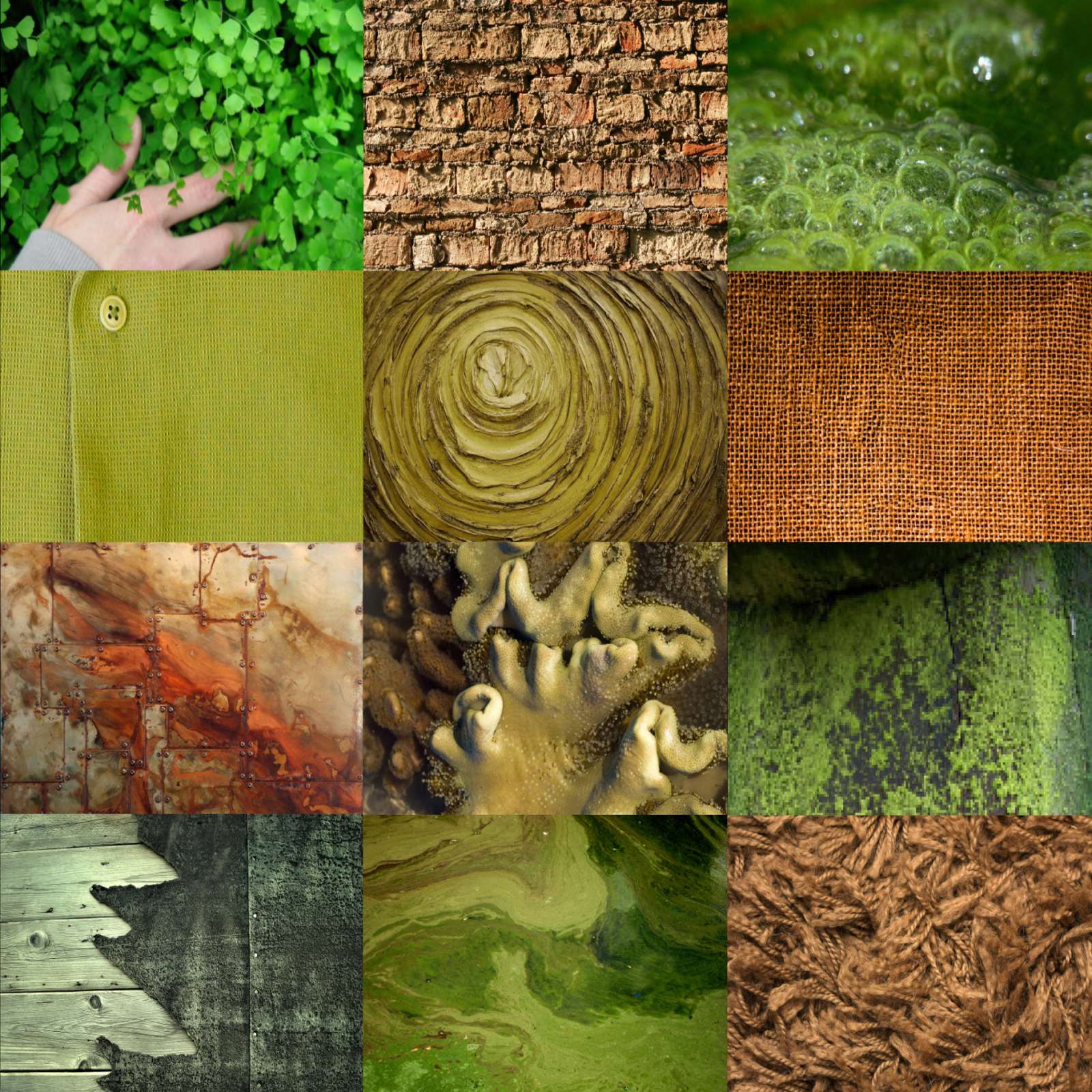
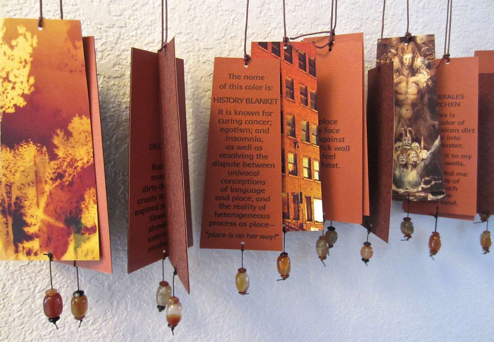
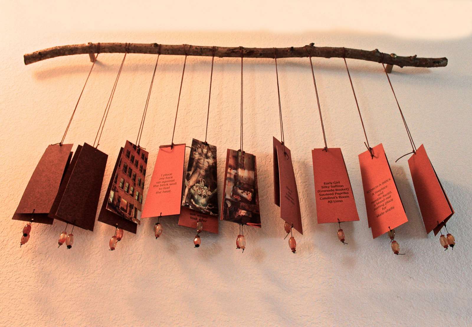
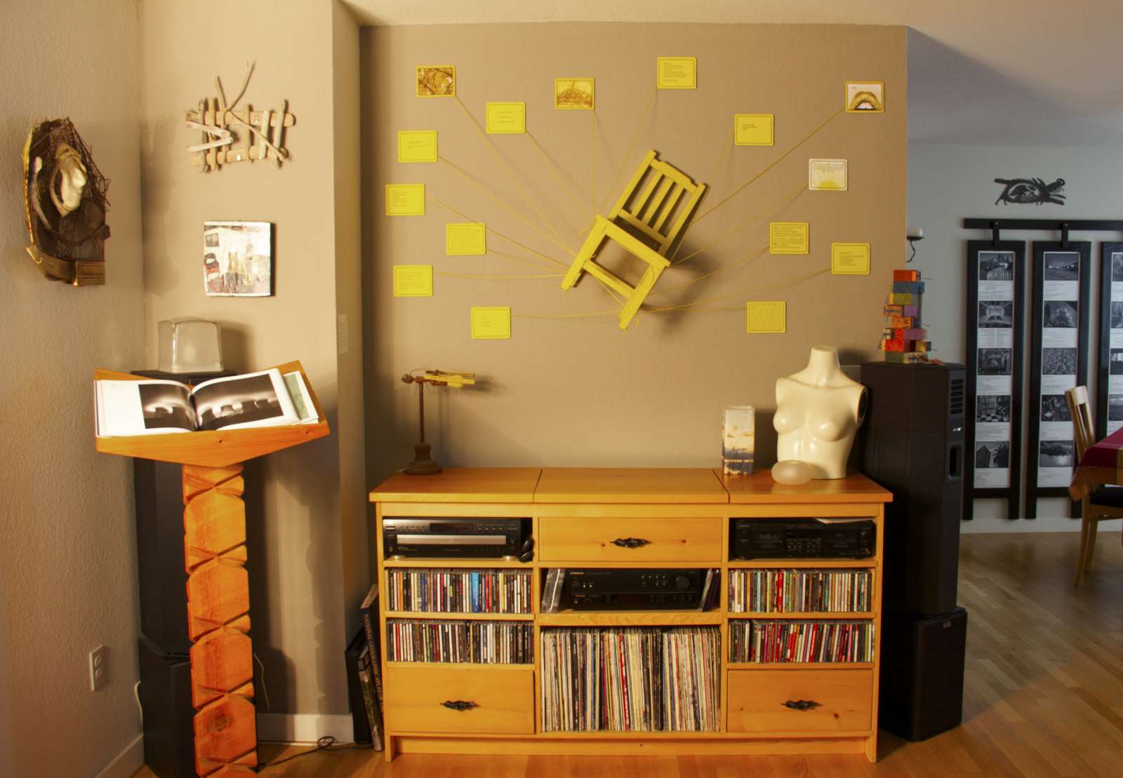
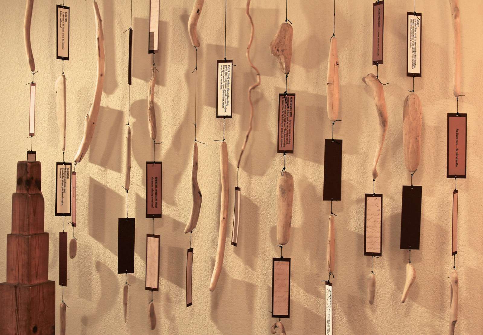
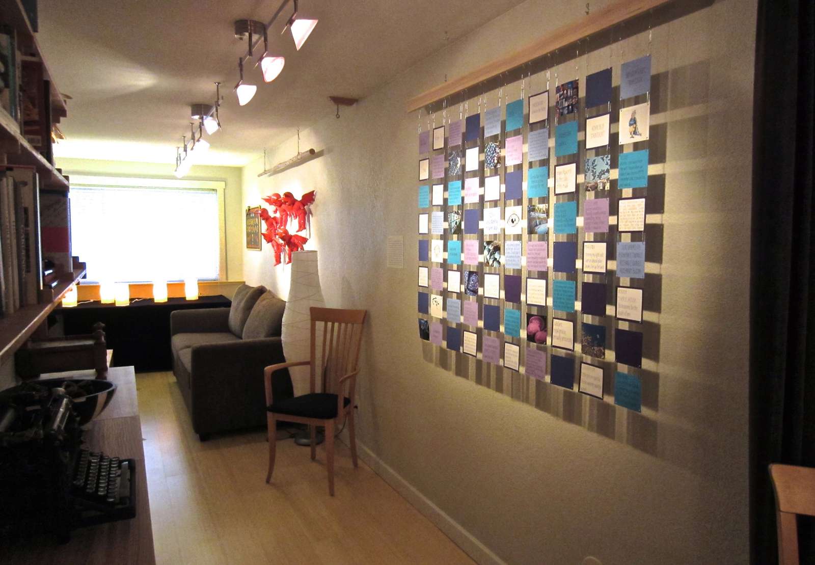
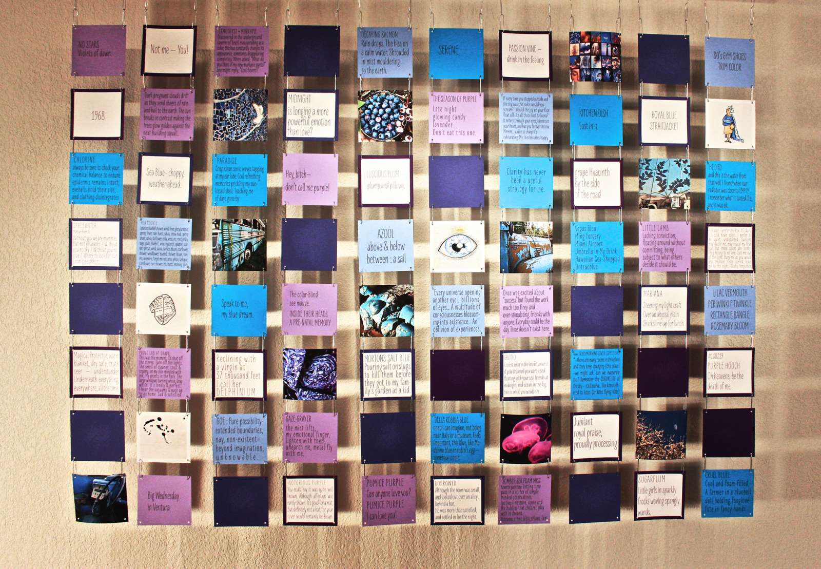
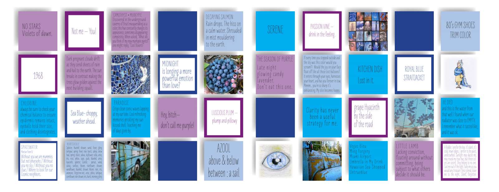
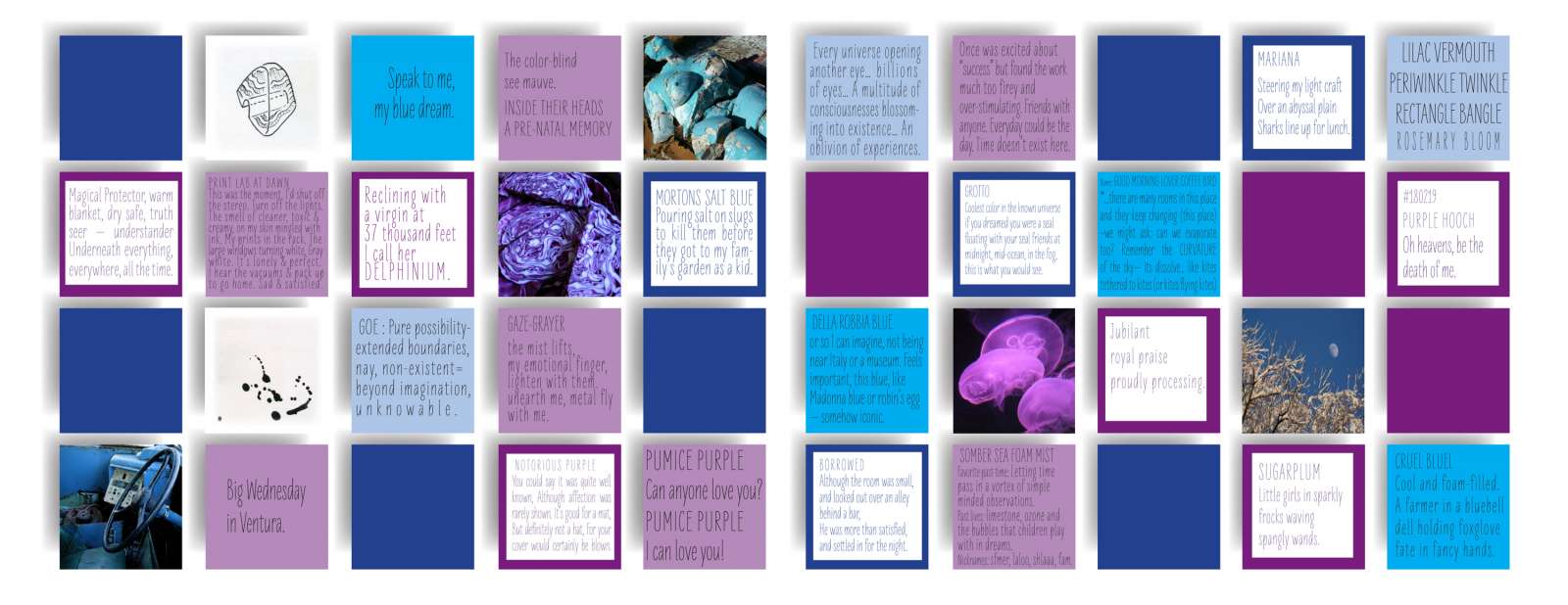
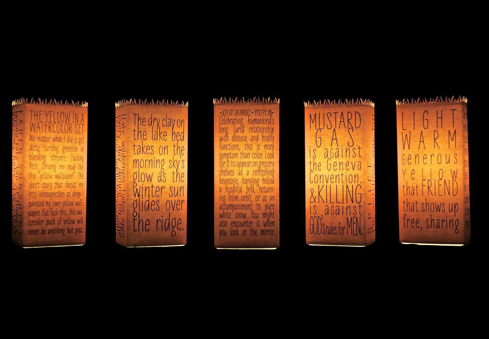
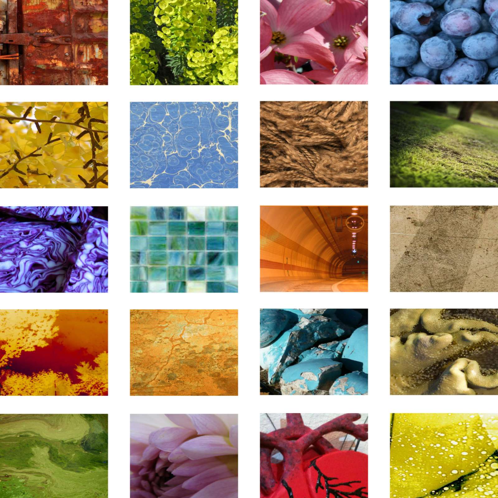
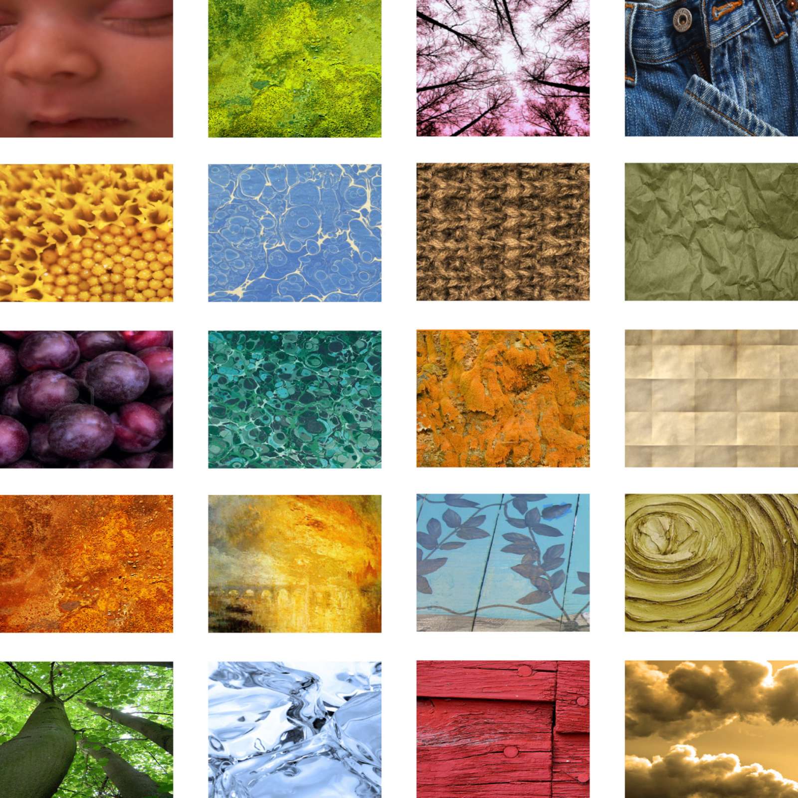
Colors have the power to sway emotions and moods, to stir associations and sensations, and thus color in multiple hues was the inspiration for another Glowing Heads collaborative art project. The twenty colors for the project were deliberately chosen to elicit a response, an emotion, a story, something other than indifference. Cerulean blue, for example, is easy to like. Puke green, on the other hand, may invoke revulsion or nausea. Each participant was presented with a random selection of four color swatches and nominal instructions. The idea was that a wide-ranging palette of colors would prompt unforeseen musing and creative consequence. The colors were divided into five groups of four; then color chips and response cards were dispatched. The physical manifestation of the project took several forms. Eleven art installations were created, some featuring a single color, such as the blood-red heart constellation and the teal-green arrow display. Other presentations were staged in multiple hues: the dual-color driftwood poetry mobile, the cool-hued shadow quilt, and the earth-tones slideshow loop. Colorful characters were invited to the Apocalypse Center to view their collective creative achievement, comparing notes and holding forth.